

The notification page layout has changed and there are some issues for me.
Possible factors on my end:
- Browser: Zen Browser 1.13.2b, mod of Firefox 139.0.4.
- Piefed settings: increased font size, but the Settings page doesn’t show me the current size setting so I can’t say what it is.
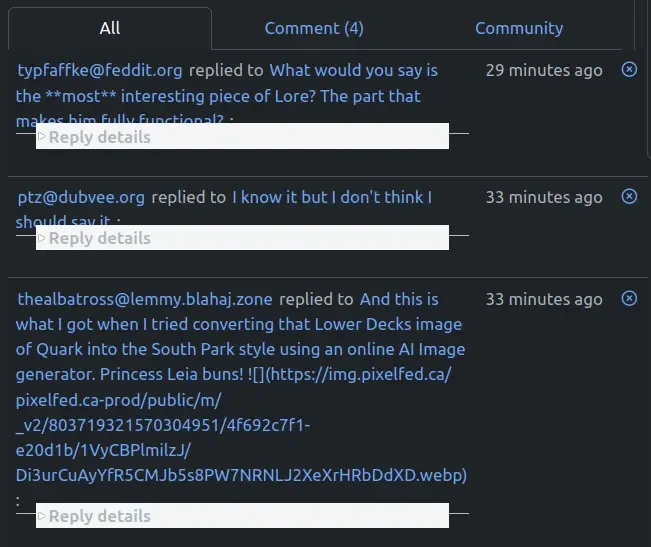
The previous “All” notification screen was clear, compact, had the same height for each notification and only took one click to open anything.
Now the notification heights are variable, some truly huge (as it includes the whole comment being replied to, even the markdown for the URLs of images), replies to comments require an additional click to access, and the “Reply details” line overlaps the notification title. (At least for me, not sure if it’s like that for everyone.) EDIT: Also, the nice, immediate indicator of a red dot for an unread notification is now hidden for replies to comments, until clicking “Reply details”. ANOTHER EDIT: I just spent a minute hunting down one remaining unread notification, clicking on multiple “Reply details” until I found the right one.
While some of the changes look useful (e.g. distinction between replies to comments and new posts in ‘Notify me’ communities), they get lost among the confusion created by these issues.
Is there a way to make things a bit tidier and easier to scan, with fewer clicks needed to get to things? (I looked in Settings but didn’t notice anything that might make a difference.)
You must log in or # to comment.
New notification formats are live now with a bonus mark read/unread button. Feel free to provide feedback either here or codeberg.
This is a known issue that has been reported to the dev team, but thank you!
Thanks :) Wasn’t sure if it was just me.
I just bookmarked https://codeberg.org/rimu/pyfedi/issues and will try to remember to check there before posting on issues.
There’s nothing wrong with posting here, not everybody has a codeberg account or has any idea how to report an issue.
I actually don’t think this has an existing issue on codeberg since it is so new, but we have been talking about it in the dev chat room. I am sure it is going to be addressed soon.
Thanks for the info, and great to hear devs are discussing it.
I tried registering for Codeberg at the same time as Lemmy, Proton etc but something went wrong. This finally got me to try again, and now I’m in and have added to the existing issue:
Re where to post, some projects have multiple websites and strictly divide content, e.g. Linux Mint forums are user-to-user only, and any actual issues like bugs with the OS should instead be reported on Mint’s GitHub.
Good to hear either option is OK for PieFed.
Hello, can you please retry? Seems fixed on my side
The overlap of “Reply details” with notification title seems to be fixed for me, too.
Although the other issues are the ones that are more frustrating. E.g. as the red dot is hidden for replies, again I had to click multiple “Reply details” to find the unread one for your message.
I am working on redoing the notifications page a bit. You can see a preview of what it will look like and provide feedback here. It will probably be a day or two for me to finish updating the templates for all the different notification types.
Thanks! :)
To be honest, I don’t really understand the text of that post, but I looked at the images and made a comment there.
Thank you for the issue!


