

The notification page layout has changed and there are some issues for me.
Possible factors on my end:
- Browser: Zen Browser 1.13.2b, mod of Firefox 139.0.4.
- Piefed settings: increased font size, but the Settings page doesn’t show me the current size setting so I can’t say what it is.
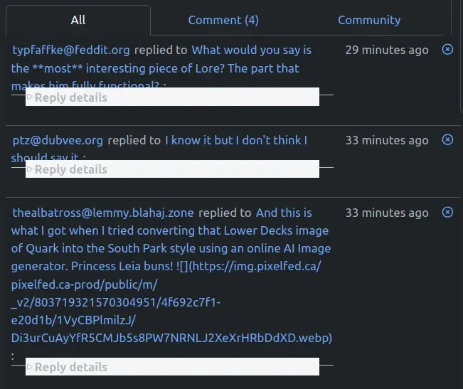
The previous “All” notification screen was clear, compact, had the same height for each notification and only took one click to open anything.
Now the notification heights are variable, some truly huge (as it includes the whole comment being replied to, even the markdown for the URLs of images), replies to comments require an additional click to access, and the “Reply details” line overlaps the notification title. (At least for me, not sure if it’s like that for everyone.) EDIT: Also, the nice, immediate indicator of a red dot for an unread notification is now hidden for replies to comments, until clicking “Reply details”. ANOTHER EDIT: I just spent a minute hunting down one remaining unread notification, clicking on multiple “Reply details” until I found the right one.
While some of the changes look useful (e.g. distinction between replies to comments and new posts in ‘Notify me’ communities), they get lost among the confusion created by these issues.
Is there a way to make things a bit tidier and easier to scan, with fewer clicks needed to get to things? (I looked in Settings but didn’t notice anything that might make a difference.)
New notification formats are live now with a bonus mark read/unread button. Feel free to provide feedback either here or codeberg.
Not having to click loads of “Reply details” to see the red dot to find which one is unread makes life much easier. Thanks!
The height being (almost) uniform (with drop down arrows to show content), makes it much easier on the eye to read and scan. Thanks!
Markdown still being shown in replies: less than ideal but manageable now due to the above changes.
The height of notifications does vary a bit depending on the type of notification. Some of the admin notifications in particular are a bit taller than the others, but I did try to tame them. The nice thing about how the notifications were re-architected by Jolly is that each one is a separate template file. So, if we want to tweak a specific type of notification, it is easier to do now compared to before.
Raw markdown in the notification is good feedback. This isn’t something I had tested when working on how these display, I can take a look at this.
Cool, thanks!