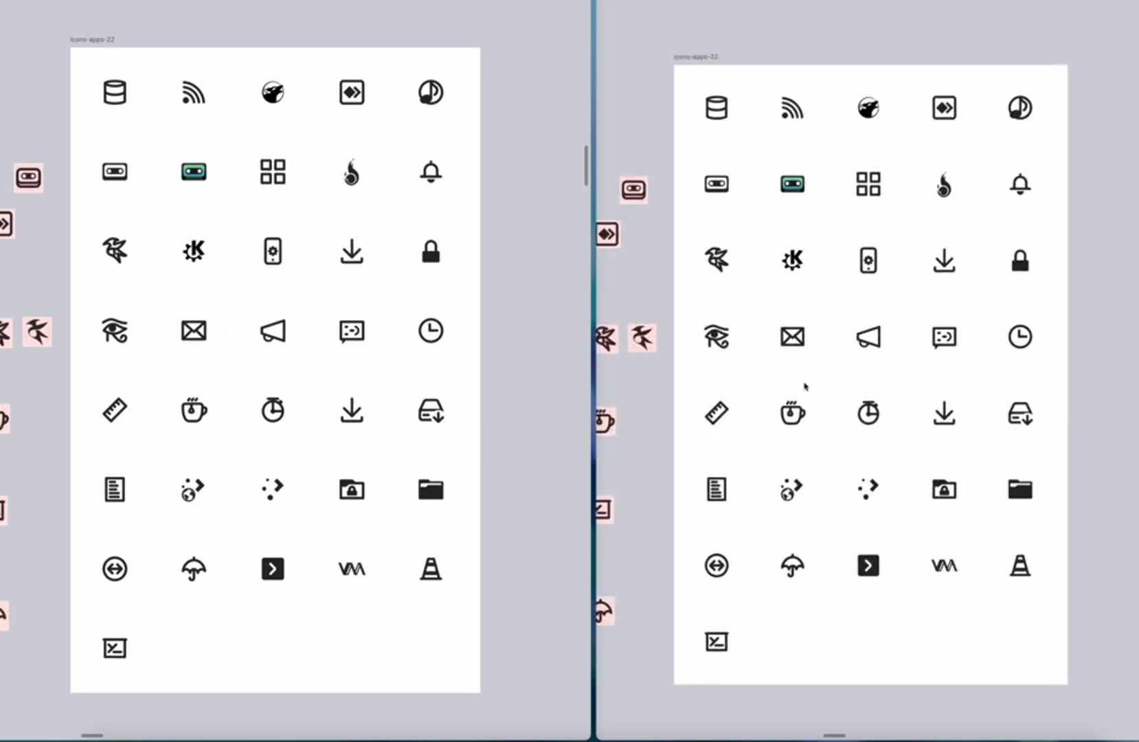
Removing the color-coding of mimetypes, for accessibility for “color blind” people. (Like me!)

(this is not my work, just posting here)

Removing the color-coding of mimetypes, for accessibility for “color blind” people. (Like me!)

(this is not my work, just posting here)
It’s great that since 5.x they’re giving attention to the tiny action icons. Pinheiro did an amazing work on apps, places and other icons with the Oxygen set in the KDE 4.x era, but its mini action icons were kind of lost and had too much detail. Though with 5.x they did some great improvement about consistency, the 1px thickess just didn’t help too much into readability.
I do icons and have done icons for KDE in the past so I can tell that indeed the work they have done is huge and the result is outstanding.
Interesting! Yes I think the Breeze icons are pretty good but look bad anyways. The sharp edges, and 1px are an issue when fractional scaling.